Cafe Di Dolce
Let’s take a short trip back to the year 1994… Imagine walking through Café Di Dolce’s doors in Kuruçeşme. Behind the counter busy with preparations is Nilgün Sağyaşar, Dolce’s creator and the mastermind behind the smallest of details. The tantalising smell of cakes made only on order and using nothing but fresh fruit and pure chocolate is everywhere. Take a seat in the corner. A delicious sandwich and cup of fresh tea is enough to teleport you to France or anywhere you please.
Years later, Café Di Dolce’s acclaimed delicacies will be at arm’s reach at Istinye Park under the management of the Nusret chain. With a holistic approach, Sanayi313 Architects goes beyond interior design to address every detail from crockery to packaging, menu to staff dress code.
Architectural details from Enis…
What is the story behind Café Di Dolce’s architectural identity? What did Sanayi313 Architects team envisage? Let’s hear it from Enis.
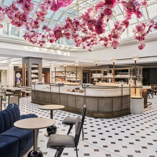
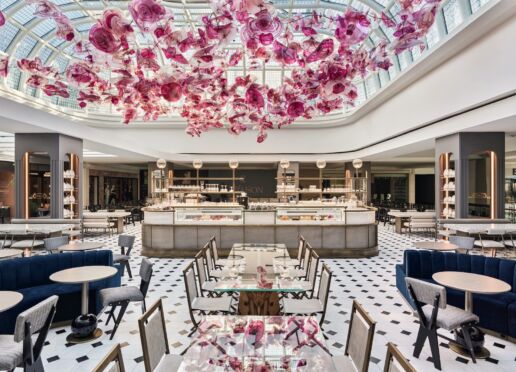
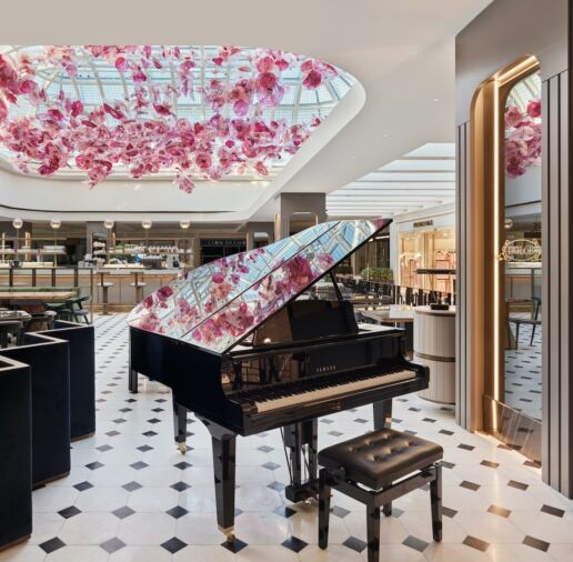
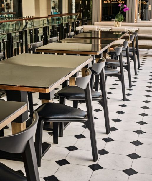
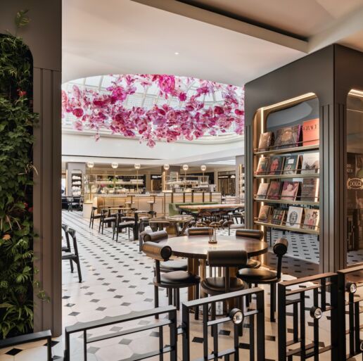
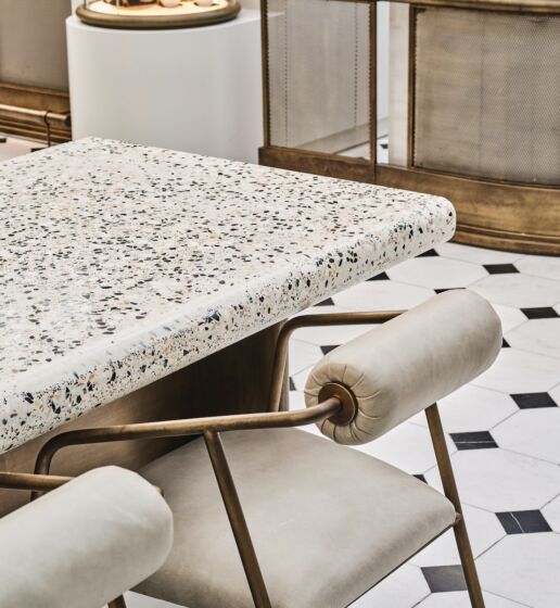
“There is a dome over Dolce’s place in Istinye Park. Inspired by classical French patisseries, we started off with the idea of applying patterns on the glass panes of the dome as a tribute to the art of stained glass. Next, we wanted to refer to Dolce’s trademark floral cakes. This is when we decided to work with the talented glass artist Naide Büyükkaymakçı. Considering safety, we used plexiglass instead of real glass to make the peonies suspended from the ceiling. By doing so, we wanted to underline the perception of a feminine, cosy patisserie. The light fixtures were designed according to Büyükkaymakçı’s installation. The restaurant hasn’t got walls which I believe to give a sincere and welcoming atmosphere. The impressive dome and the peonies create a unique effect as you walk down Istinye Park’s jewellery corridor. The black and white marble flooring delivers a nostalgic feeling. As for furniture, we used a mixture of materials like wood, glass, bronze and terrazzo to create a sense of contrast. Cumulatively, these refined choices make you feel as if you’re having tea in the lobby of Plaza Hotel in New York or Paris.”
Naide Büyükkaymakçı’s account…
I usually work with glass and leather. Sanayi313 came with the idea of making a glass installation for Café Di Dolce. However, we’re talking about a large area and the glass would have been too heavy. So, I did some trials with plexiglass. Working with a new material was thrilling. After a few meetings with Sanayi313, I focused on making a model. The project got the green light however there wasn’t a lot of time left for production and installation. A team of eight people worked relentlessly for two months to make it to the deadline.
There was a partial screen around the space during installation however the compliments I overheard during the process was motivating both for me and the team.
What was it like for architect Gülin Güzel? She takes us through the design process…
“While the surface of floor defines the boundaries of the space, we believe that walls must make the user feel these boundaries at the eye-level and three-dimensionally. Surrounded by respected brands inside Istinye Park, our innovative Café Di Dolce project is located on a rectangular, 401 square meter central area without any separating walls.
On the plus side, the location enjoys daylight from the glass vault above. However, our biggest constraint was the rule that prevented us from installing anything that might hinder the visibility of the surrounding stores.
This left us with the challenge of giving the users a sense of boundaries and make the place stand-out in a subtle way without undermining the visibility of the stores around it.
Several ideas were exchanged on how to create a three-dimensional perception without walls. We decided on creating a roof over the space to increase the presence of the ceiling. We envisaged an installation which would complement Dolce’s essence. We briefed Naide Büyükkaymakçı about our dream and left the rest in her talented hands. Now we were able to define the boundaries of the place with a powerful perception of the ceiling.
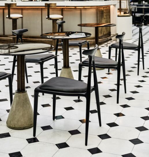
To create a plain feeling at the eye level in an original way and for users to discover new details on every visit, we chose black chairs in seven different models. Each chair model was paired with a different seating unit and table. We positioned the bar and cake display in the centre to integrate the service circulation with that of the general circulation inside the mall and build on a sense of vibrancy. The overall form was determined by uniting the letters C and D from Cade di Dolce on the layout.
We fitted in a Disklavier piano in the corner since we strongly believe that live music spreads positive energy in an atmosphere.
Design alone is not adequate; the application must also be of superior quality for a project to make a difference.
On opening day, Edith Piaf’s Milord was playing on the piano in the background.
La Vie en Rose;
Sanayi313 created a magical world in Dolce.


